Hey guys – want to see how I made this? Well its pretty easy…just takes some time…and easy to follow steps which is what I typed out for you guys!

Lets begin the tutorial: Start by opening a new document – any size you want is fine. 500px x 500px is good and big.
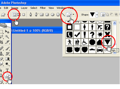
In the tools panel go select the custom shape tool. Than we go to the top of the screen and select the shape we want to use in our case it is like a yield sign triangle shape with rounded edges. Make sure all your shape properties look like this.

Once you have that shape selected we can start by selecting a foreground color for our shape:


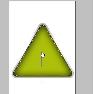
Go to the center of your document (I will call it the work stage) Hold down on CTRL (cmnd with mac) and drag out the mouse in any direction and release it when you have reached the size you want. This will create the shape on a new layer. Rename that layer”Triangle”. The triangle is upside down now – that’s ok. Just go to EDIT>TRANSFORM>FLIP VERTICAL and viola. That should do it.
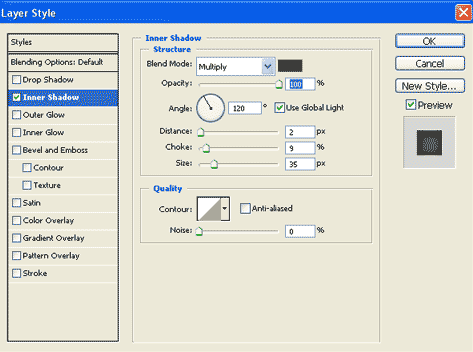
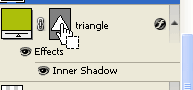
Now go to the layers panel and right click while over the triangle layer and click on “blending option” .This will pop up the blending options box. Select Inner Shadow and check the box. Give it the following values:
Blend mode: multiply
Color: Black
Angle :120
Distance: 2
Choke: 9
Size 35
as screenshot.

Click OK. Good.
Now take your cursor and place it over the triangle icon and hold down on CTRL (mac=cmnd) and CLICK.

This will give you a triangle selection on your work stage. Now add a new layer in your layers panel:
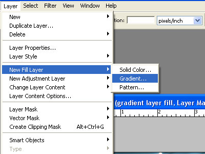
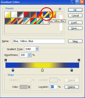
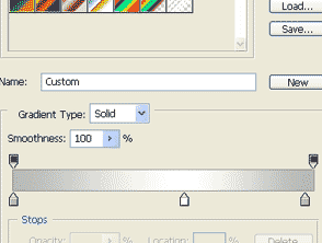
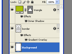
Rename that layer ” Border”. and drag it down to below your triangle layer. Make sure your “border” layer is the one selected and now go to top of screen and SELECT>MODIFY>EXPAND>and type in 10-12 px and click ok. (The more pixels you choose the thicker your border will be) you will see what I mean soon. Now hold down on alt and at the same time press Backspace. This will fill your new selection. While still on the border layer right click and click on blending options. In the blending options box check off and select the “gradient overlay ” Blend mode shouold be set to normal and opacity to 100. now click on the gradient strip to open the gradient editor options .
From the presets at the top select a three striped one like so:

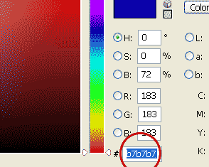
It doesn’t matter which you choose because we will change the colors now. Select one of the “stops” just below the gradient strip . Than click on the color box at the very bottom left

and it will open a color selection box which you will enter the follwong values #b7b7b7
Press ok. Do the exact same to the other stops within the gradient editor until you have this.

Than press ok again. On your stage you should be seeing this.

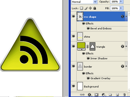
Your layers panel should look like this:

Now we are going to add a cool shine to the triangle using the gradient tool. first add a new layer -same way as done previously.

Rename that layer “Shine” . With the shine layer being slected roll your mouse over the triangle icon once more and Click the mouse while holding down on ctrl. This will again give you the triangle selection . Now go to SELECT> MODIFY>CONTRACT and type in 3 pixels and click ok.

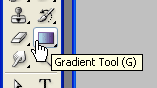
Still on the shine layer – go select the gradient tool from the Main tool bar.

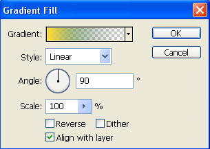
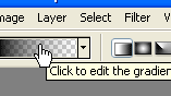
Go to the top of page and put in the correct properties for the gradient we want to use. To edit gradient we go here:

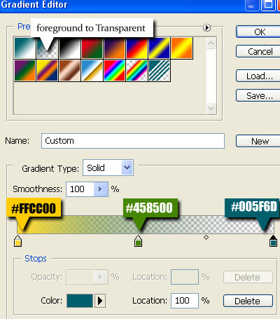
a new box pops open and than select the “foreground to Transparent”

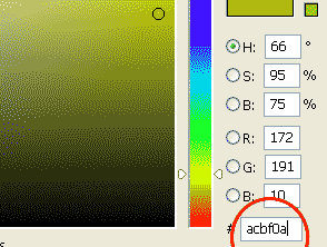
Than go change the color of the one “stop” box . This time make the color a light yellowy green (#FFFC24)
click ok. NOw take your mouse over to your work stage. place your mouse just below the triangle and hold down on ctrl and drag upward to about half way through the triangle.

Like so. and release. this will create a nice shine. Now in your layers panel add a new layer and rename it “RSS ICON” – I will not start explaining how to do this shape….as it can get complicated . SO please download this RSS ICON here – and just drag it from within photoshop to your “rss icon” layer. Resize it accordingly.
You should now see this :

NOw again in your layers panel create a new layer and Rename it Glass. We are now going to give it a nice new glassy effect. With this layer selected bring your mouse over the triangle Icon again and hold down on ctrl and click
This will select it..again. Go to SELECT>MODIFY>CONTRACT and type in 3 pixels – click ok.
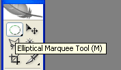
go to the main toolbar and select the “ELIPTIC MARQUEE TOOL”

Go to the work stage and hold down on alt. Your cursor should transform from an arrow to a crosshairs with a minus sign attached.
It should be placed approximately here – about in the vertical middle of the shape , to the left side – as seen in the above screenshot. With alt still being held down…..now drag it to the right side of shape all the way across. and release

your selection should look like this. now go select the Gradient tool from the main tool bar again. Make the foreground color white. You can set the foreground from within the main tool bar. (This gradient style should be like the last one we did – Foreground to transparent – since it was the last one you used – your properties should still be set to it – so have no worries) NOw bring your mouse to the work stage and place it just above the triangle shape and selection and drag downward to about middle of shape. The tutorial ends here…you should see this.

I really hope you all can benefit from this tutorial..as i put some serious thought and time into it.

Lets begin the tutorial: Start by opening a new document – any size you want is fine. 500px x 500px is good and big.
In the tools panel go select the custom shape tool. Than we go to the top of the screen and select the shape we want to use in our case it is like a yield sign triangle shape with rounded edges. Make sure all your shape properties look like this.
Once you have that shape selected we can start by selecting a foreground color for our shape:

Go to the center of your document (I will call it the work stage) Hold down on CTRL (cmnd with mac) and drag out the mouse in any direction and release it when you have reached the size you want. This will create the shape on a new layer. Rename that layer”Triangle”. The triangle is upside down now – that’s ok. Just go to EDIT>TRANSFORM>FLIP VERTICAL and viola. That should do it.
Now go to the layers panel and right click while over the triangle layer and click on “blending option” .This will pop up the blending options box. Select Inner Shadow and check the box. Give it the following values:
Blend mode: multiply
Color: Black
Angle :120
Distance: 2
Choke: 9
Size 35
as screenshot.
Click OK. Good.
Now take your cursor and place it over the triangle icon and hold down on CTRL (mac=cmnd) and CLICK.
This will give you a triangle selection on your work stage. Now add a new layer in your layers panel:

Rename that layer ” Border”. and drag it down to below your triangle layer. Make sure your “border” layer is the one selected and now go to top of screen and SELECT>MODIFY>EXPAND>and type in 10-12 px and click ok. (The more pixels you choose the thicker your border will be) you will see what I mean soon. Now hold down on alt and at the same time press Backspace. This will fill your new selection. While still on the border layer right click and click on blending options. In the blending options box check off and select the “gradient overlay ” Blend mode shouold be set to normal and opacity to 100. now click on the gradient strip to open the gradient editor options .
From the presets at the top select a three striped one like so:
It doesn’t matter which you choose because we will change the colors now. Select one of the “stops” just below the gradient strip . Than click on the color box at the very bottom left

and it will open a color selection box which you will enter the follwong values #b7b7b7
Press ok. Do the exact same to the other stops within the gradient editor until you have this.
Than press ok again. On your stage you should be seeing this.

Your layers panel should look like this:
Now we are going to add a cool shine to the triangle using the gradient tool. first add a new layer -same way as done previously.
Rename that layer “Shine” . With the shine layer being slected roll your mouse over the triangle icon once more and Click the mouse while holding down on ctrl. This will again give you the triangle selection . Now go to SELECT> MODIFY>CONTRACT and type in 3 pixels and click ok.

Still on the shine layer – go select the gradient tool from the Main tool bar.
Go to the top of page and put in the correct properties for the gradient we want to use. To edit gradient we go here:
a new box pops open and than select the “foreground to Transparent”
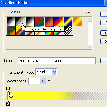
Than go change the color of the one “stop” box . This time make the color a light yellowy green (#FFFC24)
click ok. NOw take your mouse over to your work stage. place your mouse just below the triangle and hold down on ctrl and drag upward to about half way through the triangle.
Like so. and release. this will create a nice shine. Now in your layers panel add a new layer and rename it “RSS ICON” – I will not start explaining how to do this shape….as it can get complicated . SO please download this RSS ICON here – and just drag it from within photoshop to your “rss icon” layer. Resize it accordingly.
You should now see this :
NOw again in your layers panel create a new layer and Rename it Glass. We are now going to give it a nice new glassy effect. With this layer selected bring your mouse over the triangle Icon again and hold down on ctrl and click
This will select it..again. Go to SELECT>MODIFY>CONTRACT and type in 3 pixels – click ok.
go to the main toolbar and select the “ELIPTIC MARQUEE TOOL”
Go to the work stage and hold down on alt. Your cursor should transform from an arrow to a crosshairs with a minus sign attached.

It should be placed approximately here – about in the vertical middle of the shape , to the left side – as seen in the above screenshot. With alt still being held down…..now drag it to the right side of shape all the way across. and release

your selection should look like this. now go select the Gradient tool from the main tool bar again. Make the foreground color white. You can set the foreground from within the main tool bar. (This gradient style should be like the last one we did – Foreground to transparent – since it was the last one you used – your properties should still be set to it – so have no worries) NOw bring your mouse to the work stage and place it just above the triangle shape and selection and drag downward to about middle of shape. The tutorial ends here…you should see this.

I really hope you all can benefit from this tutorial..as i put some serious thought and time into it.