Sunday 18 November 2012
The New Microsoft Office (Office 2013)
Even at this early stage, I really like The New Microsoft Office, but it's important to point out that this suite of productivity apps is not free. So I wouldn't blame you for asking why a business would pay for it when it could get a comparable set of office tools from Google Docs for a lot less or even free. But after using The New Microsoft Office (that's the official name of the entire suite) for a few days, I can tell you that there are plenty of reasons for trading up.
For starters it's available wherever you are, on whatever device you're using at the time, and with full touch-screen support, the entire suite has been reinvented to work with Windows 8-driven tablets, regular keyboard-and-mouse desktop setups, and even smartphones. Along with a completely reinvented interface, all of these things come together to make it the best Office yet.
C is for convenience
Like most recent versions of Office, the suite comes in many versions with tiered packages from the cloud-supported Office 365 to the desktop standalone Office 2013. Whether you choose to pay for Office 2013 or sign up for a subscription to Office 365, the bigger challenge for Microsoft will be how it markets the suite to both businesses and individual consumers to show why they need to make the switch at all.
So how could Microsoft do it? In a word: convenience. I'm not just talking about the convenience of continuing to use what you've used before -- I'm talking about the suite itself. What Microsoft has done in this latest version is make Office useable on a tablet running Windows 8 and, in converting the myriad productivity tools to support touch screens, the company had to make most actions only one click (or tap) away. So while it has streamlined the suite out of necessity, it's now easier to use than ever before.
Office also offers an enormous number of templates across the suite (with even more available online) to fulfill almost any business need. Almost all have a polished and professional look so you'll waste almost no time creating documents from scratch. In my testing, the suite of apps worked seamlessly together -- and with Microsoft's services -- making collaboration, sharing, and internal communication much easier.

The Ribbon is still here and offers a wealth of tools across each tab as it detects the most common uses for the content you have selected. But if you don't like the Ribbon, you now have the option to hide it and bring it back only when you need it.
(Credit: Screenshot by Jason Parker/CNET)The new interface across the entire suite of applications has been reinvented, mostly for the better. First off, the Ribbon, which disappointed many users when it first appeared in Office 2007, remains part of the new Office. But before you start grumbling, consider that Microsoft has made it optional this time around. So now you can show or hide the exhaustive collections of tools across every tab, and decide how much or how little you want to use them. In my review of Office 2010 I liked the Ribbon, but I've heard enough from users who disagree to know that Microsoft has made a wise change.
Aside from the Ribbon, the interface is similar but much simpler than it was in Office 2010 and earlier. Flat buttons and plenty of white space make the interface look less crowded. Newly added start pages for Word, PowerPoint, and Excel help you get to recent documents and new templates immediately upon launch. Other interface tweaks are tablet-focused such as the radial menus in OneNote that show options (like sharing, search, and zoom tools) in a circle around the area you pressed. The general feel of the suite is more streamlined and more cloud-integrated, and it seems like it will be useful to those looking at the same documents on several devices.

The new Presenter View in PowerPoint shows you the next slide in the presentation on the right and offers tools (like a virtual laser pointer) and your notes on the left so you always know what's coming up next.
(Credit: Screenshot by Jason Parker/CNET)The main core apps of the suite have all been updated with the new look and several new features that can be used with touch-screen tablets, desktop computers, and smartphones.
Microsoft says it is trying to make a smoother experience all around, which is shown not just in the interface, but with tweaks to the apps that will make getting things done easier. As an example, a new Read Mode in Microsoft Word lets you flip through documents like a book (on a tablet) and offers only the features that help you with common reading actions such as controls for defining words, translations, and searching the Web. But flashier additions in the new version of Word also let you view video right within documents (with an online connection). There are also other time-savers like the option to collapse sections of a document to get them out of the way, and a navigation pane that lets you know at a glance where you are in the document. Some of these options probably just seem like common sense, but what Microsoft has done has made many complex actions in earlier versions of the suite only require a couple of clicks.
Related stories
- Microsoft's jazzed up Office to run on tablets, cloud
- CNET Reviews: The New Microsoft Office (Office 2013)
- New Microsoft Office gets more social
- Microsoft unveils new OneNote
- Microsoft announces new version of Office
- Redesigning bloat: How Microsoft Office got a makeover
- Microsoft's new Office: The cloud finally takes center stage
- Complete coverage of the new Office
In the more business-oriented apps, the theme is the same: cutting out steps to streamline your work flow. For example, Microsoft's diagramming app, Visio, helps you create diagrams more easily with more options to collaborate with others in fewer steps. Like the one-click changes already mentioned in Word, PowerPoint, and Excel, Visio offers quick customizations so you can diagram shapes and themes in only a couple of clicks. The software is tightly integrated with the other apps in the suite as well, letting you easily link diagram shapes from common data sources including Excel, SQL Server, SQL Azure, and SharePoint External Lists. What you're getting with the new Microsoft Office is a suite that plays together nicely and that will likely mean you can complete projects in less time.

By making the new Office ready for touch screens, Microsoft streamlined many of the most common tasks to only require a couple of clicks. One of the new features of Excel is the ability to highlight data, and have the software recommend the best chart or graph to represent that data.
(Credit: Screenshot by Jason Parker/CNET)Microsoft's enterprise services, including Exchange, SharePoint, and Lync, are the glue that holds the whole enterprise suite together and a number of improvements make communication between the moving parts of an organization more streamlined and secure in the new suite. In Exchange, new Data Loss Prevention features help you monitor and protect sensitive data, and a new Exchange eDiscovery Center lets you monitor and analyze SharePoint, Lync, and Exchange data from a single interface. SharePoint has been improved as well to help you share ideas and get instant feedback on projects using improved customizable team sites where you can stay in sync with coworkers. Lync offers a unified client for voice and video calls along with instant messaging for a consistent experience across all devices, from your Web browser to your smartphone. All of the services attempt to make collaboration easier and Microsoft has succeeded in streamlining every service so diving in is not as daunting as it was in earlier versions of suite.
Conclusions
The new Microsoft Office tries to cover all the bases for productivity, and in my early tests, it does an admirable job. With the focus on making the suite available on Windows 8 tablets, the company made many actions easier across the suite out of necessity, making it easier to learn how to use by both businesses and individual consumers regardless of the device they are working on.
With that said, one of my biggest early challenges in testing the software was learning how to navigate Windows 8 before I could even get to the Office apps. This is important because if you're going to follow Microsoft into the world of the touch-screen OS, you may run into the same challenges I did. After a couple of days of testing I was able to navigate the OS quickly, but I think it's worth noting that there is an additional learning curve with Windows 8 before you take the leap.
The question (much like with Windows 8) is how people will receive the new interface, and whether users will embrace the touch-screen technology. Are we going to see a surge in Windows 8 tablets purchased as a result, or will people ignore the new tech and stick with their desktops?
Another question I have is whether businesses will opt for the cheaper Google Docs experience, and if consumers will continue to use Google Docs for free. Office may be a better overall experience, but it's no secret money can be the deciding factor for many people. In the end, we won't know for sure until early next year when The New Microsoft Office is released, but from what I've seen, this version could be the must-have office suite, if Microsoft can convince businesses and users to discard the free-to-play options for a more polished, integrated, and streamlined experience.
Microsoft serves up 60-day trial version of Office 2013
A free, two-month evaluation version of Office Professional Plus 2013 is now available for those who'd like to try before they buy.

Microsoft Word 2013.
(Credit: Screenshot by Lance Whitney/CNET) The version available is the full Microsoft Office Professional Plus 2013 suite, which includes Word, PowerPoint, Excel, Outlook, OneNote, Access, Publisher, and Lync. The software contains all the features in the paid edition, so you won't miss out on anything.
You will need a Microsoft account in order to access the download page, but otherwise there are no strings attached.
Here's how you can grab the free trial version:
Head over to the Office Professional Plus 2013 download page on TechNet. Click on the Get Started Now button. Log in with your Microsoft account. Fill in the online form with your name, e-mail address, and other details, if it's not already filled in. Make sure to choose either the 64-bit or 32-bit version of Office. Click Continue.
Another online form pops up asking for more information. Again, click Continue. The next page displays the product key, which you'll want to write down or save. Choose your language and click the Download button. Office is downloaded as a 785MB file.
Related stories
Alternatively, Windows 8 users can set up the file as a virtual drive by right-clicking on it and selecting the Mount command. Windows 7 users would need to use a product such as Virtual CloneDrive to do the same thing.
Once the file is mounted, you can simply double-click on the virtual drive or run the Office setup file to install the program.
Office 2013's hardware and software requirements aren't especially taxing. But those of you still stuck on Windows XP or Vista are out of luck. The new suite runs only under Windows 7, Windows 8, Windows Server 2008 R2, and Windows Server 2012.
General availability of the suite is expected in early 2013. Microsoft has not yet released official prices, but ZDNet's Mary Jo Foley recently reported on a leaked document showing a $499 price tag for Office Professional Plus 2013.
Originally posted at Microsoft
Glassy & Vibrant Rss feed icon Tutorial – Vista Style.
Hey guys – want to see how I made this? Well its pretty easy…just takes some time…and easy to follow steps which is what I typed out for you guys!

Lets begin the tutorial: Start by opening a new document – any size you want is fine. 500px x 500px is good and big.
In the tools panel go select the custom shape tool. Than we go to the top of the screen and select the shape we want to use in our case it is like a yield sign triangle shape with rounded edges. Make sure all your shape properties look like this.
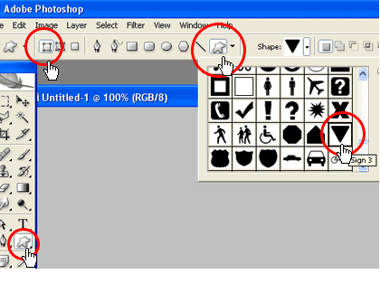
Once you have that shape selected we can start by selecting a foreground color for our shape:

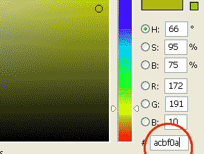
Go to the center of your document (I will call it the work stage) Hold down on CTRL (cmnd with mac) and drag out the mouse in any direction and release it when you have reached the size you want. This will create the shape on a new layer. Rename that layer”Triangle”. The triangle is upside down now – that’s ok. Just go to EDIT>TRANSFORM>FLIP VERTICAL and viola. That should do it.
Now go to the layers panel and right click while over the triangle layer and click on “blending option” .This will pop up the blending options box. Select Inner Shadow and check the box. Give it the following values:
Blend mode: multiply
Color: Black
Angle :120
Distance: 2
Choke: 9
Size 35
as screenshot.
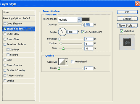
Click OK. Good.
Now take your cursor and place it over the triangle icon and hold down on CTRL (mac=cmnd) and CLICK.

This will give you a triangle selection on your work stage. Now add a new layer in your layers panel:
Rename that layer ” Border”. and drag it down to below your triangle layer. Make sure your “border” layer is the one selected and now go to top of screen and SELECT>MODIFY>EXPAND>and type in 10-12 px and click ok. (The more pixels you choose the thicker your border will be) you will see what I mean soon. Now hold down on alt and at the same time press Backspace. This will fill your new selection. While still on the border layer right click and click on blending options. In the blending options box check off and select the “gradient overlay ” Blend mode shouold be set to normal and opacity to 100. now click on the gradient strip to open the gradient editor options .
From the presets at the top select a three striped one like so:
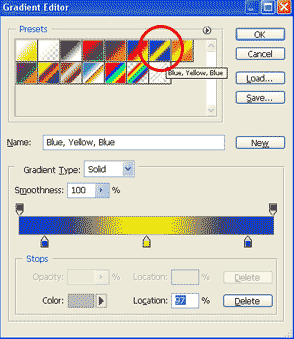
It doesn’t matter which you choose because we will change the colors now. Select one of the “stops” just below the gradient strip . Than click on the color box at the very bottom left

and it will open a color selection box which you will enter the follwong values #b7b7b7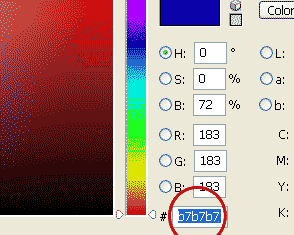
Press ok. Do the exact same to the other stops within the gradient editor until you have this.
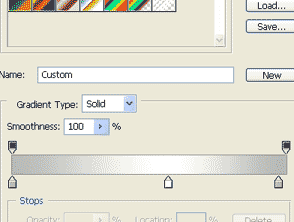
Than press ok again. On your stage you should be seeing this.

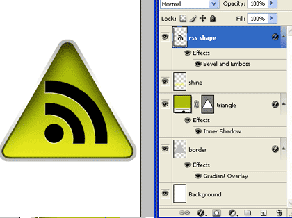
Your layers panel should look like this:
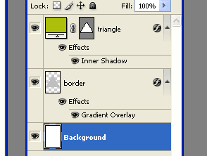
Now we are going to add a cool shine to the triangle using the gradient tool. first add a new layer -same way as done previously.

Rename that layer “Shine” . With the shine layer being slected roll your mouse over the triangle icon once more and Click the mouse while holding down on ctrl. This will again give you the triangle selection . Now go to SELECT> MODIFY>CONTRACT and type in 3 pixels and click ok.

Still on the shine layer – go select the gradient tool from the Main tool bar.

Go to the top of page and put in the correct properties for the gradient we want to use. To edit gradient we go here:

a new box pops open and than select the “foreground to Transparent”
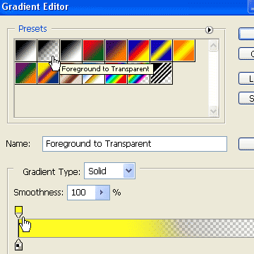
Than go change the color of the one “stop” box . This time make the color a light yellowy green (#FFFC24)
click ok. NOw take your mouse over to your work stage. place your mouse just below the triangle and hold down on ctrl and drag upward to about half way through the triangle.
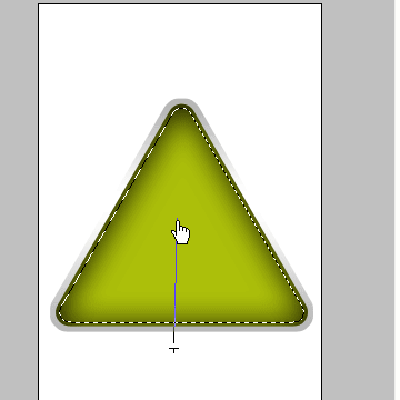
Like so. and release. this will create a nice shine. Now in your layers panel add a new layer and rename it “RSS ICON” – I will not start explaining how to do this shape….as it can get complicated . SO please download this RSS ICON here – and just drag it from within photoshop to your “rss icon” layer. Resize it accordingly.
You should now see this :
NOw again in your layers panel create a new layer and Rename it Glass. We are now going to give it a nice new glassy effect. With this layer selected bring your mouse over the triangle Icon again and hold down on ctrl and click

This will select it..again. Go to SELECT>MODIFY>CONTRACT and type in 3 pixels – click ok.
go to the main toolbar and select the “ELIPTIC MARQUEE TOOL”
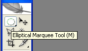
Go to the work stage and hold down on alt. Your cursor should transform from an arrow to a crosshairs with a minus sign attached.
It should be placed approximately here – about in the vertical middle of the shape , to the left side – as seen in the above screenshot. With alt still being held down…..now drag it to the right side of shape all the way across. and release

your selection should look like this. now go select the Gradient tool from the main tool bar again. Make the foreground color white. You can set the foreground from within the main tool bar. (This gradient style should be like the last one we did – Foreground to transparent – since it was the last one you used – your properties should still be set to it – so have no worries) NOw bring your mouse to the work stage and place it just above the triangle shape and selection and drag downward to about middle of shape. The tutorial ends here…you should see this.

I really hope you all can benefit from this tutorial..as i put some serious thought and time into it.

Lets begin the tutorial: Start by opening a new document – any size you want is fine. 500px x 500px is good and big.
In the tools panel go select the custom shape tool. Than we go to the top of the screen and select the shape we want to use in our case it is like a yield sign triangle shape with rounded edges. Make sure all your shape properties look like this.

Once you have that shape selected we can start by selecting a foreground color for our shape:


Go to the center of your document (I will call it the work stage) Hold down on CTRL (cmnd with mac) and drag out the mouse in any direction and release it when you have reached the size you want. This will create the shape on a new layer. Rename that layer”Triangle”. The triangle is upside down now – that’s ok. Just go to EDIT>TRANSFORM>FLIP VERTICAL and viola. That should do it.
Now go to the layers panel and right click while over the triangle layer and click on “blending option” .This will pop up the blending options box. Select Inner Shadow and check the box. Give it the following values:
Blend mode: multiply
Color: Black
Angle :120
Distance: 2
Choke: 9
Size 35
as screenshot.

Click OK. Good.
Now take your cursor and place it over the triangle icon and hold down on CTRL (mac=cmnd) and CLICK.

This will give you a triangle selection on your work stage. Now add a new layer in your layers panel:

Rename that layer ” Border”. and drag it down to below your triangle layer. Make sure your “border” layer is the one selected and now go to top of screen and SELECT>MODIFY>EXPAND>and type in 10-12 px and click ok. (The more pixels you choose the thicker your border will be) you will see what I mean soon. Now hold down on alt and at the same time press Backspace. This will fill your new selection. While still on the border layer right click and click on blending options. In the blending options box check off and select the “gradient overlay ” Blend mode shouold be set to normal and opacity to 100. now click on the gradient strip to open the gradient editor options .
From the presets at the top select a three striped one like so:

It doesn’t matter which you choose because we will change the colors now. Select one of the “stops” just below the gradient strip . Than click on the color box at the very bottom left

and it will open a color selection box which you will enter the follwong values #b7b7b7

Press ok. Do the exact same to the other stops within the gradient editor until you have this.

Than press ok again. On your stage you should be seeing this.

Your layers panel should look like this:

Now we are going to add a cool shine to the triangle using the gradient tool. first add a new layer -same way as done previously.

Rename that layer “Shine” . With the shine layer being slected roll your mouse over the triangle icon once more and Click the mouse while holding down on ctrl. This will again give you the triangle selection . Now go to SELECT> MODIFY>CONTRACT and type in 3 pixels and click ok.

Still on the shine layer – go select the gradient tool from the Main tool bar.

Go to the top of page and put in the correct properties for the gradient we want to use. To edit gradient we go here:

a new box pops open and than select the “foreground to Transparent”

Than go change the color of the one “stop” box . This time make the color a light yellowy green (#FFFC24)
click ok. NOw take your mouse over to your work stage. place your mouse just below the triangle and hold down on ctrl and drag upward to about half way through the triangle.

Like so. and release. this will create a nice shine. Now in your layers panel add a new layer and rename it “RSS ICON” – I will not start explaining how to do this shape….as it can get complicated . SO please download this RSS ICON here – and just drag it from within photoshop to your “rss icon” layer. Resize it accordingly.
You should now see this :

NOw again in your layers panel create a new layer and Rename it Glass. We are now going to give it a nice new glassy effect. With this layer selected bring your mouse over the triangle Icon again and hold down on ctrl and click

This will select it..again. Go to SELECT>MODIFY>CONTRACT and type in 3 pixels – click ok.
go to the main toolbar and select the “ELIPTIC MARQUEE TOOL”

Go to the work stage and hold down on alt. Your cursor should transform from an arrow to a crosshairs with a minus sign attached.

It should be placed approximately here – about in the vertical middle of the shape , to the left side – as seen in the above screenshot. With alt still being held down…..now drag it to the right side of shape all the way across. and release

your selection should look like this. now go select the Gradient tool from the main tool bar again. Make the foreground color white. You can set the foreground from within the main tool bar. (This gradient style should be like the last one we did – Foreground to transparent – since it was the last one you used – your properties should still be set to it – so have no worries) NOw bring your mouse to the work stage and place it just above the triangle shape and selection and drag downward to about middle of shape. The tutorial ends here…you should see this.

I really hope you all can benefit from this tutorial..as i put some serious thought and time into it.
Subscribe to:
Posts (Atom)


